Challenge
Our mission was to boost the application’s efficiency and reliability, aligning it with rapid technological advancements and stringent environmental standards. The project aimed to revamp the user interface and underlying technologies, ensuring robust performance, minimal operational costs, and environmental conservation.
As Croatia’s transmission system operator, HOPS is responsible for:
- Operating and maintaining Croatia’s high-voltage electricity grid
- Ensuring the stability and reliability of the national power system
- Facilitating electricity transfers between generators and distributors
- Managing cross-border power exchanges with neighboring countries
HOPS plays a crucial role in Croatia’s energy infrastructure and works to integrate the country’s power system with the broader European electricity market. Therefore, it is imperative that they have a robust application capable of delivering and displaying crucial information at data.
Solution
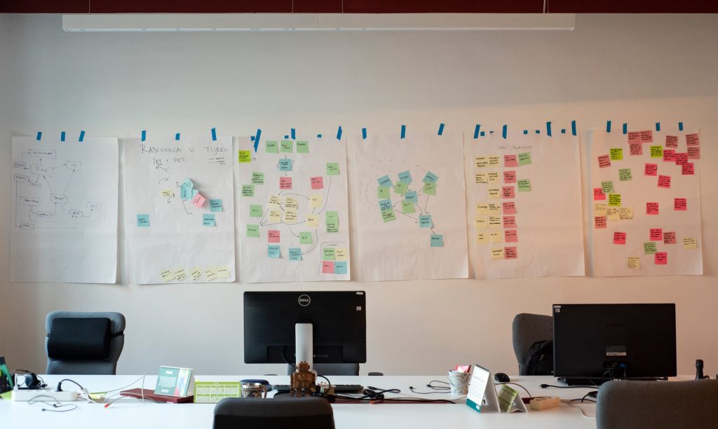
The project began with a kickoff meeting where we discussed requirements and set the foundation for the entire process. This initial phase was crucial as it established the goals and expectations that guided us through each subsequent stage, ensuring a systematic approach that contributed effectively towards building a robust and user-friendly product.
- Product Discovery: We identified user needs, setting the stage for a design that aligns with business objectives.
- Design: We crafted a user-centric design, focusing on functionality and aesthetics to meet modern standards.
- Development: We implemented the design using advanced technologies, ensuring a seamless transition and integration.
To measure the success of this overhaul, we decided on two key performance indicators (KPIs) that would best demonstrate how effectively the product is achieving its business objectives. We focused on system performance and UX/Product KPI.
- System performance – This KPI assesses the success of the backend overhaul and the transition to advanced technologies. It monitors reduced maintenance costs, decreased update times, and improvements in system uptime and speed.
- UX/Product KPIs – This KPI evaluates the application’s functionality and reliability. It measures user interactions and the success of the updated visual design in meeting modern aesthetic standards.
To cater to user needs, we conducted interviews with each user role to understand their daily tasks and pain points.
- “Tell us how Your workday usually looks like.”
- “Which features and module do You use the most?”
- “What do You find most useful in the current application?”
- “What do You find unnecessarily complicated in the current application?”
These were just some of the questions we asked, and the answers gave us enough guidance to initiate post-interview UX design and business analysis activities.
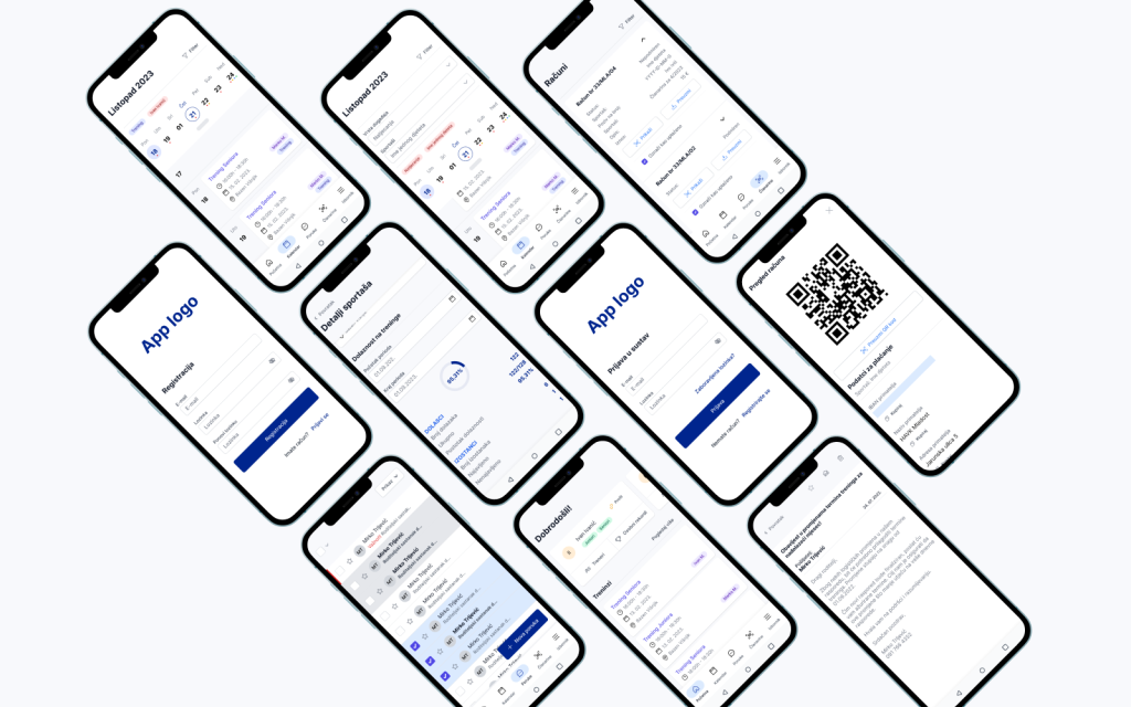
We initiated activities like information architecture and site map structuring, use case writing, and wireframing. Each design iteration resulted in a Figma prototype, which underwent usability tests until all usability issues were resolved.
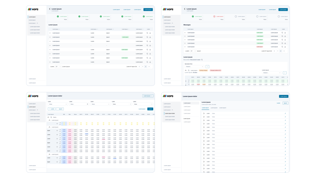
Given the design challenges, we opted for our Tiller Design System for the application’s design and front-end development. The project showcased the system’s diversity and adaptability for multiple scenarios and specific Use Cases.
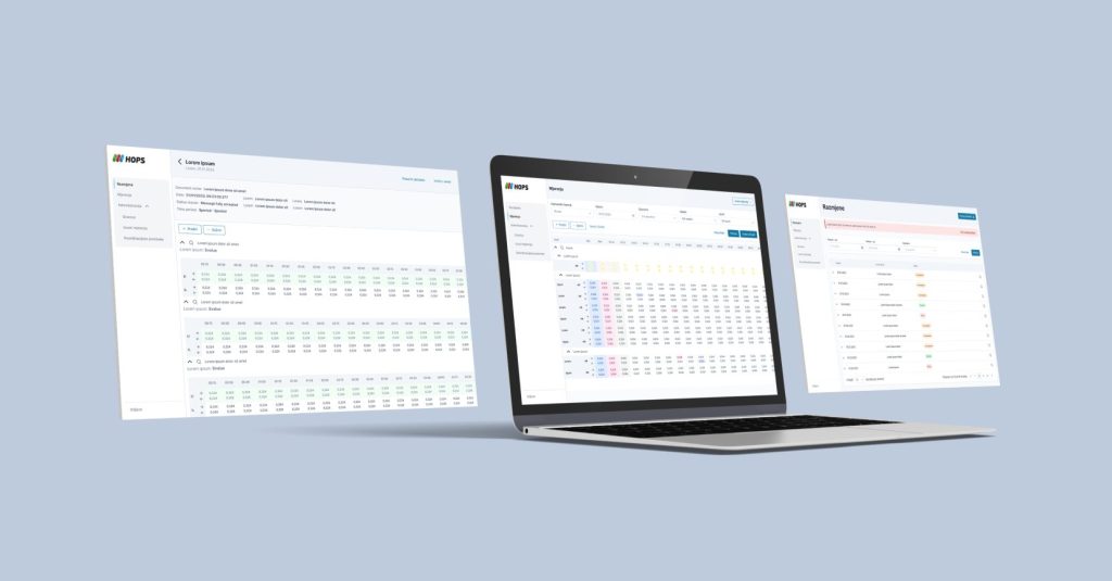
The application is heavily reliant on data display, manipulation, and filtering, so we implemented uniform patterns across various data tables to ensure consistency and efficiency. This approach not only streamlines the interaction process but also reinforces user familiarity with the system’s operations, enhancing overall usability and effectiveness in managing and analyzing data.
The application, initially built with established technologies and a classic design, underwent an overhaul to incorporate modern aesthetics and better-performing technologies. While UI updates improved visibility and functionality, the primary focus was on enhancing system performance. These upgrades addressed critical error resolution and introduced essential new functionalities, significantly improving performance, reliability, and user experience.
We encourage you to delve into our blogs and our comprehensive Application redesign case study. Come, share our joy in a project that stands as a testament to the transformative potential of design, harmonized with data and a profound comprehension of user requirements.
Industry
Tags
Falls Sie Fragen haben, sind wir nur einen Klick entfernt.

