Enhance your IBM Cognos Analytics customized reporting with DataWizz extension based on ISO 24896 for clear, consistent, actionable insights.
In today’s data-driven organizations, clarity and consistency are non-negotiable. Leaders expect reports that highlight what matters, analysts need visual standards they can rely on, and organizations want reporting processes that scale efficiently.
This is where the International Business Communication Standards (IBCS) Association played a leading role in advancing the topic, driving its evolution toward global adoption through ISO 24896 – Notation for business reporting, published on 11 June 2026. ISO provides the international framework as the owner of the standard, while IBCS Standards remain fully aligned with and contribute to the broader ISO approach to business reporting notation.
- International Business Communication Standards (IBCS)
- ISO/DIS 24896 – Notation for business reporting
IBCS is built around the well-established SUCCESS formula, a set of visual communication principles designed to make business reports clearer, more comparable, and easier to interpret.
As an IBM Partner, CROZ brings these standards directly into IBM Cognos Analytics through our new visualization extension based on ISO 24896. We also offer services to customize your IBM Cognos reports, tailoring dashboards, templates, and charts to your organization’s specific needs. This enables companies to modernize dashboards, unify reporting practices, and accelerate decision-making.

Use Case Example: Income Statement Visualization (P&L Redesign)
Problem
The finance team distributes a monthly P&L in a traditional table format. Analysts spend hours scanning rows to identify trends, anomalies, or variances. Commentary is often unclear or buried in text, making it difficult for management to grasp the real story.
Solution
Redesign the P&L using a vertical waterfall chart
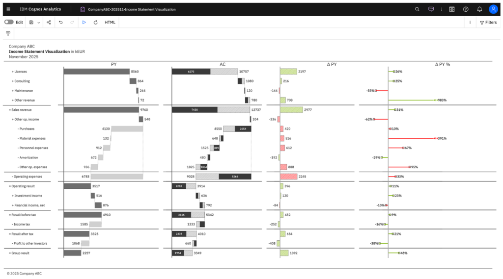
Features include:
Calculation waterfall: shows how revenues, costs, and other line items cumulatively build toward net profit (e.g., Sales revenue → Operating result → Group result).
Variance visualization: additional waterfall tiers display absolute and relative deviations from plan or prior year.
Notation: solid, outline, or hatched bars clearly distinguish actuals, budgets/plans, forecasts, and prior-year values.
Message-driven titles and consistent formatting: key insights are immediately visible without deep analysis.
Benefit
Monthly review time decreases dramatically – from hours to minutes.
Management instantly sees which line items drive profit or loss.
Variances are transparent, enabling faster root-cause analysis and corrective action.
Clear, comparable visualizations improve board-level reporting and accelerate decision-making.
Waterfall & Comparison Charts
Waterfall and comparison charts reveal contributions, deviations, and trends that tables hide, while standard notation ensures semantic consistency and improves comparability across periods and projects.
5 Advanced Charts Form Our Offering That Upgrade Corporate Reporting
Standard visuals fail when reports require deep hierarchies, dynamic variance, or multi-location comparisons. Advanced chart customization bridges the gap—giving executives instant clarity and report authors full control without complex workarounds.
1. Small Multiples Chart
- Primary Usage: Compare the same KPI across dozens of categories (locations, business units, product lines) using a grid of identical mini-charts.
- Business Scenario: Track net profit trends, yearly absolute variances, or operational performance across 10 to 25+ distinct store locations or subsidiaries simultaneously.
- Executive Impact: Leaders spot outliers and macro trends across entities instantly without toggling interactive filters or flipping through multi-page decks.
2. Stacked Column Chart
- Primary Usage: Compare total values over time while breaking down how individual sub-components contribute to the whole.
- Business Scenario: Monitor overall revenue alongside product category mix, analyze operational expenditure by cost center, or evaluate channel performance across fiscal quarters.
- Executive Impact: Replaces clutter with context—decision-makers see macro trajectory and micro drivers simultaneously in a single view.
3. Multi-tier Column Chart
- Primary Usage: Visualize time-series or category data structured across multi-level vertical hierarchies.
- Business Scenario: Present financial metrics across structured timeframes (Year → Quarter → Month) or organize corporate performance across reporting levels.
- Executive Impact: Delivers structured business context without forcing leaders to decipher complex data tables or disconnected sub-reports.
4. Multi-tier Bar Chart
- Primary Usage: Navigate multi-level hierarchical data horizontally—ideal for long category titles and detailed member listings.
- Business Scenario: Audit department budgets, compare operational KPIs across global cost centers, or analyze detailed business function metrics.
- Executive Impact: Long, descriptive labels remain fully readable without horizontal scrolling or angled text, enabling faster review cycles during executive meetings.
5. Vertical Waterfall Chart
- Primary Usage: Explain step-by-step positive and negative variances that bridge a starting value to an ending result.
- Business Scenario: Present actual vs. budget vs. plan variances, Income Statement Visualization, or Year-over-Year growth analysis.
- Executive Impact: C-suite leaders immediately identify the core drivers behind financial results, keeping strategic discussions focused on key actions rather than math checks.
Key Takeaways
- Consistency drives clarity: Visualizations reduce interpretation errors and strengthen trust in data.
- Standardization unlocks speed: Teams save hours weekly with unified, automated Cognos templates.
- Better insights lead to better decisions: Clear visualizations focus executives on what matters.
- CROZ + IBM Cognos Analytics: a powerful combination for modern, standards-aligned reporting.
- Customization & future-ready: Tailor dashboards to your needs based on ISO 24896.
Executive Summary
CROZ extends IBM Cognos Analytics with DataWizz custom extension, based on ISO 24896 enabling organizations to deliver clearer, more consistent, and more trustworthy reports to gain faster decision cycles, improved communication, and unified dashboards and reports across all teams.
Real-world implementations - from standardized management dashboards and redesigned income statements to project budget controlling—demonstrate time savings, reduced complexity, and elevated analytics quality for leadership. Our Cognos customization services, reports and dashboards are tailored specifically to your organization’s needs, ensuring maximum clarity and impact.
Clear reporting drives confident decisions. If you want to modernize your IBM Cognos Analytics dashboards and reports the CROZ team can help.
We offer services to customize your IBM Cognos Analytics reports, tailoring dashboards, templates, and visualizations to your organization’s needs. Ask yourself: are you using the right visualizations for the insights you need? CROZ ensures your Cognos environment delivers actionable, decision-ready visualizations.
Find out more - contact CROZ sales or book a 30-minute meeting.